How to Design the Ultimate Fashion App

A mobile app is a great way to promote a fashion store. It allows consumers a great way to interact with a store wherever they are. Fashion also gives you a pretty distinct advantage. You are able to very carefully focus your marketing and content to a specific demographic. However, before you start promoting your app and raking in the rewards, you’ll need to create something your customers will love to look at and use!

1. Focus on the Product

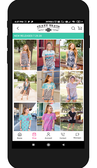
With all of the freedom non-technical users now have when it comes to design for apps and mobile websites, it can be hard not to take advantage of and create something flashy. And sometimes that’s ok! But the focus always needs to stay on the fashion! Sometimes this can be achieved in relatively obvious ways (matching color schemes to specific lines, featuring a logo that appears on your clothing, etc.). Sometimes, it requires a little more subtlety and tact. Often it pays to have the app color scheme in cool, faded or even neutral tones so that the products really pop off the page.

2. Include Functionality That Matters

Consider this an offshoot of the previous point. Mobile apps, and in particular those created on the Apptive platform, can offer a wide variety of functionality. It can be tempting to add quite a bit of extraneous options “just in case.” Unfortunately, this type of preparatory thinking can lead to a bloated app. Think about the specific ways that you want to engage with your customers, and how you want them to engage with you. Once they are in your app, you want them to be marveling at your clothes, not lost in a menu!

At a basic level, you should include your store (naturally), a way to send push notifications to your customers, and a way for your customers to contact you directly.

3. Use Images Wherever Possible

Images are probably the most important type of content you can include in your app. To put it directly, if you have the option to include an image in a section of your app, do it. This relatively minor step can dramatically increase the time a user spends in a section of your app, as well as the conversions associated with that page. The best use of images in an app is most certainly associated with and deals you might want to send out. Showcasing your clothing with a beautiful image will entice customers to take advantage of your offer as soon as they open your push notification!

4. Change Your Style With The Season

Mobile apps built with Apptive can be easily updated, meaning you are not stuck with one design! As your products change with the season, update your app accordingly. It will look relevant, it will match your new styles, and your customers will definitely take notice when they dive in! Note that you can also update designs when you are releasing a new line, or just whenever you feel like it. As long as you always make sure to keep the focus on the product, you can always match the design of your app to the mood you want to invoke.

5. Make Text Fun

People often have a great penchant for talking about their fashion in person, but we occasionally see people tone down their language when it comes to their app. Because you (hopefully) use comparatively smaller amounts of text when dealing with a mobile audience, you need to make every word have serious impact! We’re not talking about inserting flowery language here, but using sensory words will inspire your mobile audience to stick around and read more.

These tips will help you put together the ultimate fashion app! With the right approach, you’ll have your customers shopping your latest styles right from your app in no time. Let us know if you’ve got any more tips for creating an app to showcase your fashion store!

P.S. Want to get started with a mobile app for your online store? Just click here and you’ll have your own in a flash!

2013 Year in Review: Five Key Mobile Mentality Posts

calendar

2013 was a year of incredible growth, not just for Apptive, but for the mobile ecosystem as a whole. 2014 is set to continue the trend as advanced mobile strategy sets the divide for ecommerce merchants worldwide.

In order to make sure you get 2014 kicked off on the right foot, we curated some of the most useful posts from the Apptive blog up to this point. Check these out to get caught up on mobile strategy for the new year!

Think Mobile, Act Local

Have a physical presence but want to engage with your users on mobile devices? This post will give you insight into a mobile customer’s mindset and strategies to effectively engage them.

Infographic: Email Marketing vs. Facebook Page vs. Mobile App

How do you market to an online audience? This infographic will give you a quick (and dare we say, attractive?) visual guide to three primary methods of digital marketing.

The Smartphone Impulse

Impulse buying has a bad rep. This blog post will show you how to trigger impulse purchases the right way in order to increase customer satisfaction as quickly as you increase your sales.

How to Match App Design to iOS7

2013 also marked the release of Apple’s most significant update of their iOS operating system. This post will help you match the style of your app to the iOS7 standard.

Infographic: M-commerce and You!

Mobile ecommerce is the most rapidly growing trend for online store owners. This infographic will give you a good idea of the current state of m-commerce and how to use it for your online store.

We appreciate all of our readers and hope that these posts have proved and will continue to prove helpful. Check back often for more insights in 2014 and beyond!

Mobile App as Testing Ground

testground

Mobile apps give you a direct line to your customers, meaning they can serve as an excellent ground for testing innovative new ideas when you want an immediate response. We’ve put together a list of several ideas for tests you can perform with your mobile app to get immediate feedback for new products, business strategies, and beyond!

1. Branding – Because you can always edit the design of your mobile app it is possible to introduce new branding elements to a mobile audience first to gauge reaction and easily tweak before making them wide-scale.

2. Product Interest – Send a direct message to your fans with some basic info on a new product and link them to the pre-order or info page. You can get immediate feedback on the interest level your product generates.

3. Audience – As we’ve mentioned, a mobile audience is incredibly diverse. So, if you want to determine the type of services or products that appeal to your audience, or even if you want to get an idea of what percentage of your audience has an interest in a new direction your business is taking, a mobile app gives numerous direct opportunities for discovering that info.

4. Limited Release – Setting up a deal for a “limited time offer” of a new product and service on a recurring basis can let you know what customers are excited about. based on redemption, you can then turn a limited release into a full-fledged offering with the knowledge that there is significant demand for it!

5. Messaging – Some of the previous suggestions here involve sending a message to an audience, but what about testing alterations to the messaging itself? Trying out new communication styles, talking points, and focus can lead to fascinating new discoveries about your mobile customers.

We hope you find these suggestions useful. Try them out, and let us know what they reveal about your customers. Also, be sure to let us know any creative ways you’ve tested things through your mobile presence!

How to Match App Design to iOS 7

ios7 design

With the recent iOS 7 release some of the biggest buzz has been about the major redesign of UI and app elements. Though it is definitely not necessary, some of you might be interested in matching your app design to this sleek new interface so that it seems to directly integrate into the apple ecosystem. With that in mind, the following steps will help you closely match your app to the new iOS 7 conventions.

1. Simplified Icons

The new iOS 7 app icons are all very simple, flattened representations of the apps they represent (standing in stark contrast to Apple’s older, more realistic icons). To match these icons, you will need a very simplified icon without text. You should also keep it to one color, preferably a black, white or light grey.

2. Gradients

Most of the new design elements incorporate gradient backgrounds. You should make sure that your app icon, splash screen, and background all feature gradients. Note that most of these are soft gradients, so don’t make a radical jump between opposing colors if you want to match the iOS 7 design precisely. Fortunately it’s pretty easy to create a gradient in most image editing programs, and some tools will even do it for you.

3. Elegant Text

Apple has chosen Helvetica Neue as their text of choice for most UI elements due to its sleek, elegant nature. Choose an app font in the Helvetic family to approximate their text.

4. Transparency

Apple has also made many of their menus and containers transparent, allowing the gradient to show through the menus. When creating a menu for your app, make it very light grey and set the transparency high (without making the menu disappear completely).

5. White Space

iOS 7 uses a LOT of white space. You can do the same in your app, which will highlight your multimedia, text and design. Simply make sure that you don’t flood your app with large blocks of text, and follow established mobile writing tips to make everything more streamlined.

There you go! Let us know in the comments if you have any other ideas, or if you have questions about incorporating any of these elements into your mobile app.

Color Considerations For Your App

Apptive developer Brandon Fairchild gives some great tips on color choices for your app, as well as why certain options are better than others.

By the way, here are the links he discusses in the video:

http://www.colorblender.com/

https://kuler.adobe.com/create/color-wheel/

Thanks for watching!